
Main content: the layout of a page also carries meaning.
Visual semantics is not only a question of images and alt text. Layout, components and page function show what a page actually does — and that is the first thing a system tries to establish.
- What is the main content of a page?
- Why layout carries meaning
- Layout signals what kind of source you are
- Macro and micro context
- Four content types
- Four principles linking text and layout
- Query augmentation
- Why expensive algorithms are not always run
- Our example: the calculator on taxi.co.rs
- Checking an individual visual
- How to check your own page
What is the main content of a page?
The main content is the component that carries the purpose of the page. Google refers to this as a “centerpiece annotation” — a visual annotation that tells its systems which part is the primary content, as distinct from the header, the navigation and supporting blocks.
For a textual guide that is the first substantive paragraph. For a page built around a tool it is the tool itself. For a price list it is the table of fares. When the layout does not single that component out clearly, the system has to guess, and guessing is expensive.
Documents released during the antitrust proceedings against Google show a concrete version of the problem: inserted elements such as share buttons can break the sentence from which the main content is extracted, so the snippet that gets pulled does not describe the page. Correct HTML structure prevents this.
The same documents show the centerpiece annotation was limited to roughly 400 characters. That means the main content has to fit into a few sentences — which is a verifiable criterion, not a principle.
A practical check: take the first 400 characters an extractor would pull from your page, excluding header and navigation. If they do not contain an answer to the question in the title, the main content is either in the wrong place or something is interrupting it.
Why does layout carry meaning at all?
The rest of this section deals with images, alt text and visual search. This is the other half of the same subject: the layout and function of a page are also a visual signal, and probably a more consequential one than any individual image.
The reason is practical. Modern pages are not text stacked on text. Every few dozen pixels can introduce a new point of interaction, a comparison component or a data card. The information that decides a purchase is often not in a paragraph but in a card — a product, a hotel, a flight, a fare. A system that does not understand how the card is structured does not understand the page.
What is not being claimed here: there is no published Google formula linking layout to position. There are patents about layout understanding, engineer statements about main content, and quality rater guidelines that mention the effort invested in design. From that we derive an approach, not a guarantee.
Layout signals what kind of source a system takes you for
Before assessing content quality, a system assesses what kind of source it is dealing with. The same text need not rank the same on an affiliate site and on a site that actually provides the service. What a page can do is visible from its components, not from its prose.
This makes the distinction between relevance and usability fundamental. A page can be relevant — it can contain the right terms — and still not help the reader complete the task: to calculate, compare, filter, book or call. Relevance comes from the text. Usability comes from the function.
| Query type | Example | Matching layout |
|---|---|---|
| Price | how much does a taxi to the airport cost | The answer and the calculator in the first screen, the fare table immediately below |
| Local service | taxi service in the city | A list with contact details, opening hours and service area |
| Instruction | how to book a taxi | The steps, with no commercial blocks above them |
| Experience | is a taxi worth it compared with transit | A comparison, conditions and examples, with fewer commercial elements |
There is an inverse risk too. If a page suggests a function it does not have — hinting at a comparison, a filter or a calculation that does not actually work — that falls under deceptive functionality and is treated as a problem, not an advantage.
Macro and micro context
Above the fold is the macro context — it corresponds to what Google's guidelines call main content. Below the fold is the micro context, corresponding to supplementary content, and it is where most internal links belong.
| Part | Corresponds to | What it carries |
|---|---|---|
| Macro context (above the fold) | Main content | The answer to the query, the main function, the most important attributes |
| Micro context (below the fold) | Supplementary content | Less important attributes, context, limitations, internal links |
This division settles a common dilemma about where internal links go. The answer is the micro context. A link that pulls the reader away before they have their answer works against the page itself.
Planning that layout before the writing starts, rather than patching it afterwards, is part of a semantic site build.
Four content types and the queries they serve
No content type is better in itself. Which one dominates depends on how the query has been augmented.
| Content type | Serves queries about | Form on the page |
|---|---|---|
| Factual | Expertise — how much, when, under which rule | A table with a source and a date |
| Opinionated | Experience — is it worth it, what was it like | A comparison, a rating, a recorded experience |
| Structured | Attributes — symptoms, benefits, conditions | A list or table of attributes |
| Unstructured | Concepts — definition, process, significance | A paragraph that explains |
The mistake is covering all four on every page. A fare page needs factual and structured content; a guide on whether a taxi is worth taking needs opinion and unstructured explanation. A page attempting both dilutes both intents.
Four principles that link text and layout
These four principles are the bridge between our SEO section and this visual one. Without them the two read as separate subjects, when in fact they are one problem.
| Principle | What it means | Concrete check |
|---|---|---|
| Visualisation | Data is presented in the format that suits it | Is the fare a table rather than a paragraph? |
| Verbalisation | What matters visually also exists as text | Can the calculator's result be read without the graphic? |
| Commercialisation | The page lets the task be completed | Is there a call, a calculation or a booking in the first screen? |
| Contextualisation | The order of sections follows the query intent | Does the first screen answer the question in the title? |
Query augmentation: from one query to a page layout
A search engine does not process only the query that was typed; it expands it into a set of related questions. What is publicly called “query fan-out” appears in the patents as query augmentation. If you know what your query expands into, you know which components the page must have.
This is the most useful part in practice, because it turns the abstract claim that “layout carries meaning” into a procedure. The canonical query is broken into expanded variants, and each is assigned the component that answers it.
| Expanded intent | Component on the page | Claim the component carries |
|---|---|---|
| how much does a taxi cost in Belgrade | A “key facts” block in the first screen with the base fare and per-kilometre rate | The service charges base fare X and rate Y |
| price to the airport | A table row with a worked example for a typical route | The route has an estimated amount under stated conditions |
| what is the night tariff | A tariff table with the period of application | The tariff applies within the stated hours |
| calculate my ride | The calculator | The reader can produce an estimate themselves |
| who do I call | Click-to-call below the calculation | A service exists that performs the job |
| is the price regulated | A block with the source and date of verification | The amount comes from the stated instrument |
Once the table is filled in, layout stops being a matter of taste. The component answering the most common expanded intent goes in the first screen, and the rest follow the order in which the questions arise. If an expanded intent has no component, that is a gap — a functional one, not a stylistic one.
Limit: there is no public list of what a given query expands into. You fill the table from your own data — related queries in Search Console, the questions that actually arrive, and search suggestions. This is a method, not an extract from Google documentation.
Why expensive algorithms are not run on every document
Pandu Nayak, Google's head of ranking, stated during the antitrust proceedings that expensive algorithms are not run for documents that do not deserve them. For those, only core topicality and locality signals are checked.
This is the strongest argument for everything on this page. If a system first judges whether a document is worth processing in detail, then a clearly delineated main content is not cosmetic — it is what makes that judgement cheap.
The consequence is practical too: a site that is expensive to process does not get a second chance per document. Removing surplus URLs and giving the remaining ones a clear structure therefore work together, not separately. The same relationship appears as cost of retrieval in the SEO section.
Our example: the calculator on taxi.co.rs
On the taxi.co.rs project, the page /kalkulator/ has a single purpose — estimating the cost of a ride. We made two changes to it that follow the principles above.
| Change | Principle | Intent behind it |
|---|---|---|
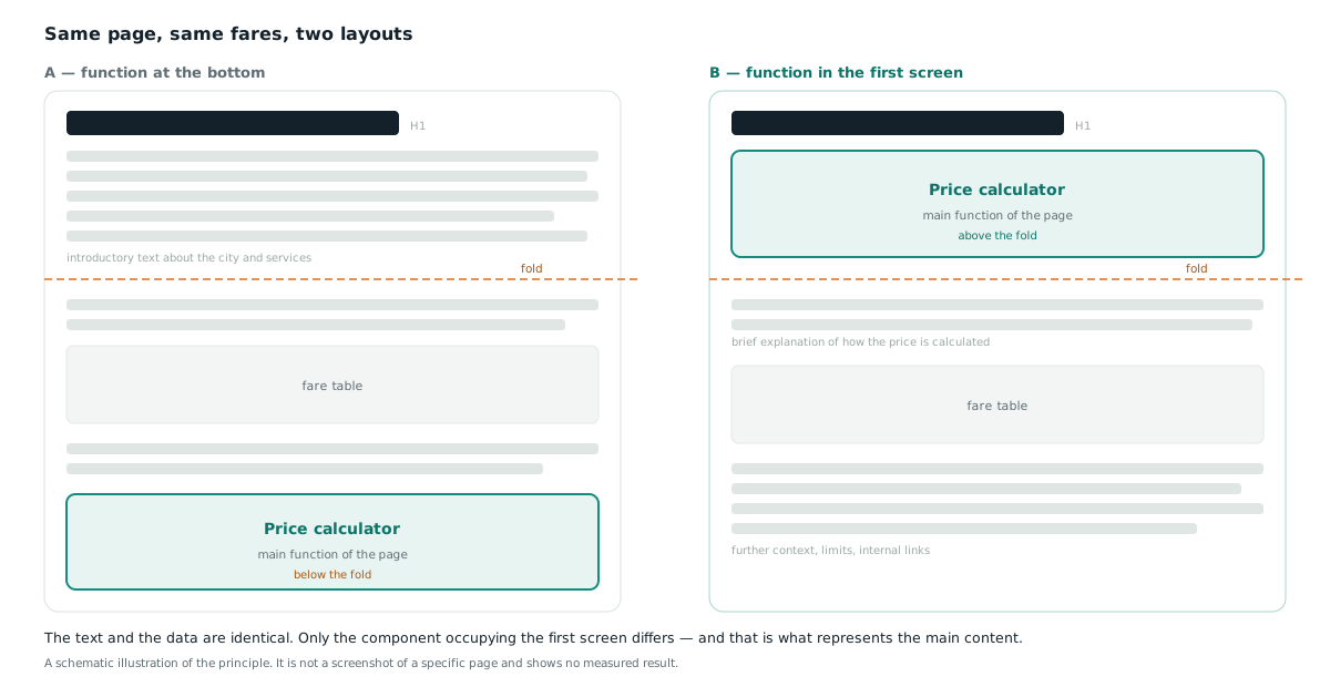
| The calculator moved nearer the top of the page | Contextualisation | The main function enters the first screen instead of sitting below the introduction |
| Belgrade taxi services with click-to-call added below the calculator | Commercialisation | After the estimate the reader can complete the task without returning to search |
The second change was deliberately placed below the calculator rather than above it. The order follows the query intent: the reader wants the price first and the phone number second. A commercial block above the tool would be exactly the mismatch described in the table in the previous section.
In the measured period the page recorded 5,955 impressions and a 14.2% share of impressions in AI search features, against a site average of 13.5%. The city fare pages, where the main content is a table of tariffs, sit considerably higher at 29.1%.
What these numbers are and are not: the layout changes were genuinely made and can be verified on the live page. The figures above are a snapshot from the project owner's Google Search Console, exported on . What we do not have is an isolated before-and-after for the layout changes themselves: they shipped together with other changes to the site, so the difference cannot be attributed to moving a component. We therefore present the changes as reasoned decisions, not as a measured result.
An open question we put to ourselves: on this site the fare table currently outperforms the interactive tool as main content. That does not mean the tool is the wrong choice — it means that for price queries a static, countable tariff may enter a generated answer more readily than a component that has to be operated.
Checking an individual visual: object, attribute, relation, context
The four principles above operate at page level. This model operates at the level of a single image or diagram, and answers whether that visual carries meaning at all or is decoration.
| Component | Question | When it fails |
|---|---|---|
| Object | What is actually visible in the visual? | A page about structured data illustrated with a stock photo of a laptop — the object does not match the topic |
| Attribute | Which visible qualities change the meaning? | Colour, state or label contradicts the surrounding text |
| Relation | How are the elements connected? | Arrows, grouping and sequence say nothing about how the concepts relate |
| Context | What does the page say the visual means? | Image, caption and explanation separated by unrelated modules |
The first component eliminates the most visuals. If the object in the image could not be named without reading the caption, the visual is not carrying information — it is following it.
The figure block pattern
Once the four components pass, the remaining question is how the visual sits in the document. The sequence we use on every page of this site:
- A heading that names the purpose of the visual.
- The image or diagram directly beneath that heading.
- A caption naming the entity, process or comparison shown.
- A paragraph explaining why the visual is there at all.
- Alt text describing the information, not the appearance.
- All of it inside the same DOM segment, with no modules inserted between.
- In structured data, only what is genuinely visible in the visual.
The sixth item is the one most often broken. When an advert, a notice or a related-content block is inserted between the image and its explanation, the connection between them stops existing for the reader and for the parser alike.
Source: the four-part model is taken from a visual-semantic audit framework published by the SEO consultant Leandro Nicor. It is one practitioner's methodology, not Google documentation or peer-reviewed research, and we use it here as a review tool.
How to check your own page
- Open the page on a phone and do not scroll. If the first screen does not make clear what the page does, the main content is in the wrong place.
- Check what interrupts the opening sentence. Share buttons, banners and notices between the heading and the first paragraph interfere with main-content extraction.
- Disable JavaScript. If the main function disappears, then for part of the system it does not exist.
- Compare intent against layout using the table above. An instructional page with a commercial block on top is a mismatch.
- Check whether you claim a function you do not have. A button that does not do what it promises is a risk, not an advantage.
- Change one thing at a time and record the date, so the change is measurable at all.
Frequently asked questions
Is “centerpiece annotation” an official ranking factor?
Google describes it as an annotation marking the primary content of a page, and it appears in documents from the antitrust proceedings. There is no published formula linking it to position, so we treat it as a principle of document understanding rather than a confirmed ranking factor.
Does that mean a tool should always be at the top of the page?
No. The component at the top should be the one that matches the query intent. For an instruction that is the steps, for a price list the fare table, for a tool the tool itself. Our own data shows the fare table outperforming an interactive calculator on one project.
Does a longer time on page mean a better result?
Not necessarily. It depends on the type of task. For tools and converters a short visit can mean the reader got what they came for quickly, while a long session can mean they could not find the answer.
Is adding a button enough to make a page functional?
No. If a component suggests a function it does not actually provide, that falls under deceptive functionality in Google's spam policies and is a risk rather than an advantage.