
leskovac.taxi: the same pattern, a markedly smaller lift for fare pages.
When one project produces a good result, that is an anecdote. This study checks the same pattern on a second project by the same agency, publishes the weaker finding, and concludes that for a local service AI impression share is not the right measure of success at all.
Why this is a control case, not a success story
On taxi.co.rs we measured that pages carrying a concrete fare enter AI answers far more often than the site average. This study checks whether the same pattern holds on another project by the same agency, in the same industry, but with one city instead of twenty-three. The result is weaker — and that is the finding.
We publish it because one project with a good result is an anecdote, not a methodology. Only when the same approach produces a different outcome in a second place does it become possible to ask why.
What can be verified publicly?
Both sites use the same approach: the city carries the fare, the price table is the main content, the calculator is a separate tool, and guides form an outer layer leading to the commercial pages.
Which results come from owner data?
Important: these figures come from the project owner's Google Search Console account for the period – , exported on . They are not publicly verifiable without access to that account and are not presented as independently confirmed.
| Measurement | Value | Source |
|---|---|---|
| Clicks | 1,140 | GSC, owner data |
| Impressions | 47,536 | GSC, owner data |
| Average position | 4.84 | GSC, owner data |
| Impressions in AI search features | 2,962 (6.3% of 47,069 property-aggregated impressions) | GSC, Generative AI Features report, 18 May – 16 August 2026 |
| Mobile share of AI impressions | 83% | GSC, owner data |
Unlike the aggregator, this site was not relaunched during the observed period, so the full three-month range is comparable with itself.
How much weaker is the pattern?
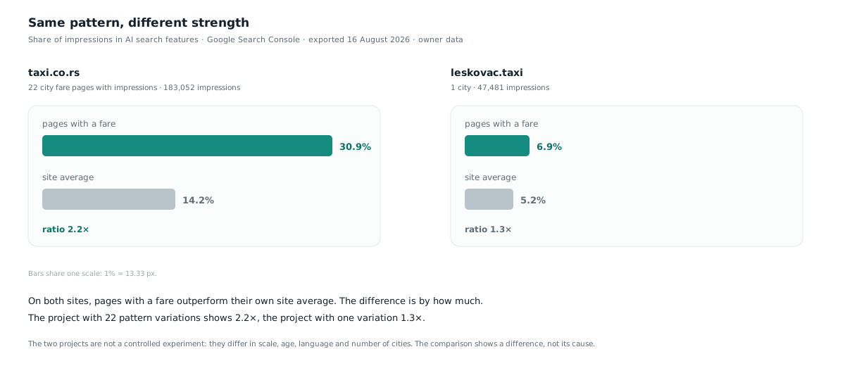
The answer depends on what is being compared with what, so the three possible comparisons are set out separately. The third is the one this study relies on, because it is the only one that does not fold two sites of different size, age and language into a single number.
| Comparison | taxi.co.rs | leskovac.taxi | Difference | What it actually measures |
|---|---|---|---|---|
| AI share of fare pages, raw | 27.5% | 6.3% | 4.4× | Mixes the difference in pattern with differences in size, age and language between the two sites. The weakest comparison. |
| Share of price-informational queries | 9.3% | 2.2% | 4.2× | Measures the query mix, not page performance. It explains why the first comparison differs. |
| Lift of fare pages over the site’s own average | 2.04× | 1.18× | 1.73× | Each site is compared with itself, so differences in size and age drop out. This is the comparison the study relies on. |
The conclusion of this study rests on the third row: on the single-city project, the lift of fare pages over the site’s own average is 1.73 times smaller. The four-times figure that appears in the section on query composition refers to the share of price queries, not to page performance, and the two must not be stated in the same sentence.
Why the tables in this study give three different totals
The same site, the same period and the same filter give 47,536 impressions in the overview, 71,301 when pages are summed, and 29,177 when queries are summed. All three are correct. They differ because Search Console does not count the same way when you group by property, by page and by query.
| Grouping | Clicks | Impressions | Why it differs |
|---|---|---|---|
| By property (overview) | 1,140 | 47,536 | When several links from one site appear in a single result, that counts as one impression. |
| By page | 1,181 | 71,301 | Each URL gets its own impression, so the sum is higher — here by half. |
| By query | 554 | 29,177 | Rare queries are not shown, so the sum is lower — 61.4 percent of impressions covered. |
The counting rule is documented: when one search element contains several links, impressions are counted either by URL or by property depending on the report view selected. The consequence is that numbers from two tables must not be added together or divided by one another unless they are grouped the same way.
In the first published version of this study these three bases were not labelled, and the share of impressions in AI features was recorded against the wrong one. Corrected on 18 August 2026. How this error is avoided is described on the page about measuring results.
| Page type | Pages | Web impressions | AI impressions | AI share |
|---|---|---|---|---|
| English version | 43 | 6,058 | 567 | 9.4% |
| Guides and destinations | 7 | 4,475 | 402 | 9.0% |
| Price and fares | 9 | 11,320 | 709 | 6.3% |
| Home page | 1 | 25,500 | 1,219 | 4.8% |
| Other | 64 | 23,948 | 885 | 3.7% |
| Sum by page | 124 | 71,301 | 3,782 | 5.3% |
The ordering resembles the aggregator in one important respect: the home page has by far the most impressions and one of the lowest AI shares. Pages answering a specific question outperform navigational ones, and that holds on both projects.
What differs is the magnitude. On the aggregator the gap between fare pages and the site average is 14.0 percentage points; here it is 1.0. On top of that, the highest share here does not belong to the fare pages but to the English version and to event pages — a pattern that does not exist in the same form on the aggregator.
First explanation: the number of pattern variations
Our working hypothesis was that variations of the same query pattern reinforce one another. The aggregator has twenty-three city hubs with their fare pages, all variations of the pattern taxi [city] fares. This site has one city, so there is nothing to multiply — the same page type exists, but without a network of related variations around it.
That hypothesis is consistent with the idea of a query template, under which authority attaches partly to the format of the query rather than only to the topic. But this comparison does not prove it, and we now consider the next explanation stronger.
Second explanation: the queries are not the same kind
Most of the difference in AI share comes from what people are actually asking. The aggregator receives price-informational queries that an AI system has something to answer. The local service receives navigational queries where the reader wants a phone number, not an explanation.
| Project | Impressions in query export | Share of total impressions | Price-informational queries | Most frequent queries |
|---|---|---|---|---|
| taxi.co.rs | 94,832 | 47.9% | 8,844 (9.3%) | taxi Belgrade price, taxi price calculator |
| leskovac.taxi | 29,177 | 61.4% | 652 (2.2%) | taxi Leskovac, taksi Leskovac |
There is nothing to summarise in response to “taxi Leskovac” — the reader wants a service to call. “How much does a taxi cost in Belgrade” has an answer that can be generated. The aggregator therefore has over four times the share of price queries, and correspondingly more opportunities to enter a generated answer.
We consider this explanation stronger than the first, because it rests on a measured composition of queries rather than on an assumption about variations reinforcing one another.
Why this is the wrong measure of success for a local service
For taxi services, the primary place of appearance in search is not the organic result but the local pack and the business profile. Measuring that kind of business by AI impression share on the website measures a secondary channel.
Business profile data for leskovac.taxi shows the scale of that difference.
| Channel | Measurement | Value |
|---|---|---|
| Business profile | Calls placed from the profile | 2,601 |
| Business profile | Total profile interactions | 2,773 |
| Organic search | Clicks to the website | 1,140 |
The business profile produces more than twice as many calls as the site receives clicks from organic search. For a local service that is both expected and desirable: a reader who calls from the local pack has completed the task, even though they never opened the website.
The aggregator has no such channel. It has no physical location and no business profile to appear in a local pack, so the organic result is its only entrance. That is a structural difference between two business models, not a difference in how well either site was built.
Limits of this comparison: we did not measure how often a local pack actually appeared for individual queries — that requires separate tooling and we did not do it. The business profile data and the Search Console data do not share an identical period or an identical definition of an event, so calls and clicks must not be added together or divided by one another. The claim that the local pack is the primary surface for the taxi industry comes from the owner's business experience, not from measurement in this study.
A limit of the source itself: Search Console does not show every query. Google does not publish how large the withheld share is, but the gap can be measured on your own data: in this export the queries cover 61.4 percent of the site’s total impressions, and 47.9 percent on the aggregator. The query composition in the table above is therefore a sample, not a census. Since the withheld part consists of rare queries, which are more often long-tail and informational, complete data might narrow the difference rather than widen it — we consider the direction of the difference more reliable than its size.
What this study does not prove
- It does not prove that the number of pattern variations causes a higher AI share. That is the weaker of the two explanations offered, and it appears first only because it was our starting hypothesis.
- It does not measure local pack appearance per query, so that influence is estimated indirectly, through query composition and business profile data.
- It does not prove that adding cities to this site would raise its AI share. An aggregator and a local service are not the same kind of business and do not share an intent.
- It does not claim that an AI impression brings a visit. Search Console's AI features report shows impressions only, with no clicks.
- It does not rule out the influence of domain age, historical click data, competition in Leskovac, or the site's English version.
- The grouping into page types is ours, derived from the URL structure. A different grouping would produce different percentages.
What follows from this for the work
- Measure by group of pages, not by individual URL. Neither of these findings would have been visible at the level of a single page.
- Do not carry a conclusion from one project to another without checking. The same approach produced a 1.73 times smaller lift for fare pages over the site average here.
- Track AI share separately from clicks. They are two different reports that do not move at the same pace.
- Check which channel the business actually converts through before choosing a metric. For a local service that may not be the website at all.
- Record the export date of your data. Without it the snapshot is not verifiable, even to yourself later.
Frequently asked questions
Does a weaker result mean the project is unsuccessful?
No. The site recorded 1,140 clicks and an average position of 4.84 in the observed period, which is a better average position than the aggregator's. The comparison concerns only the share of impressions in AI search features, not overall performance.
Why does the English version have the highest AI share?
We do not know reliably. Competition in English for local queries about Leskovac may be lower, but we did not measure that and do not present it as an explanation.
Is it valid to compare these two projects?
With limits, yes. They are run by the same agency, in the same industry, using the same methodology, and the data was exported on the same day from the same tool. They differ in scale, number of cities, age and language, so the comparison shows a difference rather than its cause.
Should a local taxi service invest in its website at all?
That is a business decision, not one this study answers. What the data shows is that for this business the business profile produced more than twice as many calls as the website received organic clicks, so choosing a success metric should start from which channel actually converts.
How these numbers are read, and why they are not added together, is set out on the page about measuring results.
A local service and an aggregator are not measured on the same channel, so their sites are not built the same way. Which channel is primary for your business is established before any changes — that is the first part of a semantic SEO audit.
Are you even measuring the right channel?
Send the URL, your sector and how you currently measure success.